08 Jul 2024 - Prajeet Shrestha
Customization of buttons in tvOS is done through buttonStyles view modifier and implementing ButtonStyle protocol.
ButtonStyle is a protocol that defines type that applies standard interaction behavior and a custom appearance to all buttons within a view hierarchy.
    struct CustomButtonStyle: ButtonStyle {

        @Environment (\.isFocused) var focused
        var backgroundColor: Color = .orange
        var foregroundColor: Color = .white

        private var padding: Double = 32.0
        private var cornerRadius: Double = 20.0
        private var strokeWidth: Double = 5.0
        private var scale: Double = 1.05

        init(backgroundColor: Color, foregroundColor: Color) {
            self.backgroundColor = backgroundColor
            self.foregroundColor = foregroundColor
        }

        func makeBody(configuration: Configuration) -> some View {
            configuration.label
                .padding(padding)
                .background(focused ? .orange : .clear)
                .foregroundColor(foregroundColor)
                .cornerRadius(cornerRadius)
                .overlay(
                    RoundedRectangle(cornerRadius: cornerRadius)
                        .stroke(focused ? .clear : .white,
                                lineWidth: focused  ? 0 : strokeWidth)
                )
                .scaleEffect(focused ? scale : 1.0)
                .animation(.easeIn, value: focused ? scale : 1.0)
        }
    }
Use the buttonStyle
    struct ContentView: View {
        var body: some View {
            VStack {
                Button {
                    print("More button tappped")
                } label: {
                    Text("More")
                        .frame(maxWidth: .infinity)
                }
                Button {
                    print("Play button tappped")
                } label: {
                    Text("Play")
                        .frame(maxWidth: .infinity)
                }
            }
            .buttonStyle(CustomButtonStyle(
                backgroundColor: .orange,
                foregroundColor: .white))
            .frame(maxWidth: 400)
        }
    }
Disection
func makeBody(configuration: Configuration) -> some View
@Environment (\.isFocused) var focused indicates whether the button is currently focused.
You can customize the button according to the focused state.
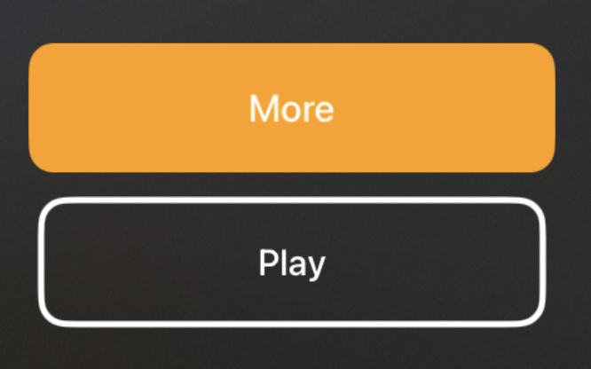
Output